Overview
MY ROLE
Product Design Intern
TIMELINE
6 weeks / Aug. - Sept. 2024
TEAM
Solo Project
Skills
Visual Design
Content Design
Design Systems
TOOLS
Figma
introduction
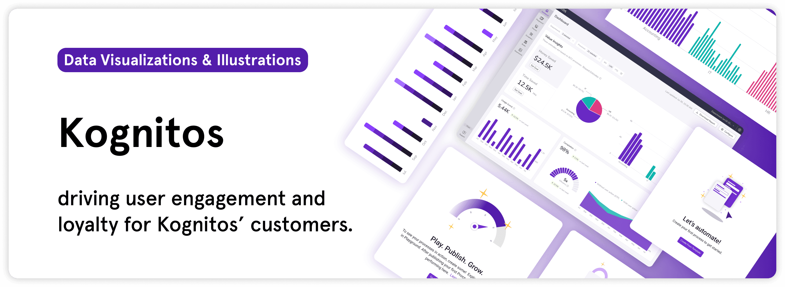
I worked with the Product Design team to design illustrations for new features and scale their design system.
Kognitos works with businesses ranging from the food and beverage industry to transportation supply chain, including Fortune 50 companies. The AI platform turns English instructions into automation processes, making code accessible and reducing businesses’ reliance on manual labor.
This work is split into 2 major projects highlighting visual design, illustrations, and design systems. I participated in multiple design reviews, iterating my designs before being shipped for development.
Project 1
Empty-state illustrations
Visual design
Content design
Project 2
UX Data Visualizations
Design Systems
Research
success metrics
15%↑
Increased user engagement
measured on the platform post implementing features
2
New clients acquired
during my time at Kognitos, I helped design new features that Sales sold to clients
“Our design is now much more accessible for users ”
-Product Designer, Kognitos
💬
project 1: empty-state illustrations
What are empty states?
Empty states are moments in a user’s experience on the platform where there is no information to display, often encountered at the onboarding or initial stages when using the product. They’re also an opportunity to guide users to take a specific action, reducing the learning curve for the product.
Bringing delight to first-time users
The first empty-state I tackled is guiding first-time users who have not created automation processes before on the Kognitos platform. How do I make users excited about automations? My first idea was to illustrate Kognitos’ “English-as-code” idea, where users can input English instructions into the AI platform to start a business automation.
IDEA 1: “English as code” illustrations
option 1
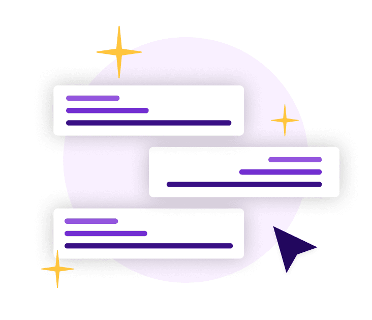
My first idea was inspired by the chat feature, where users give and receive feedback during the automation process.
option 2
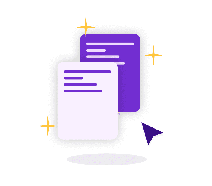
Then, I explored a visualization of templates, the call to action for users.
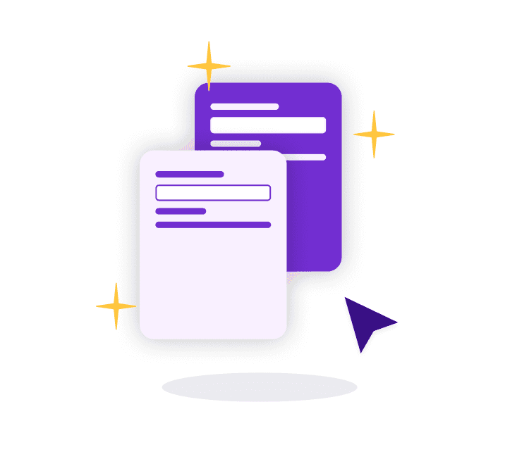
option 3
I iterated on my previous idea with a more high-fidelity version of the English visuals.
After the 1st design review, I received feedback to stray away from the ‘English-as-code’ illustrations, as it’s more conceptually complex for users. Instead, I focused my illustrations to be more simple, digestible visuals of processes.
IDEA 2: “Process” illustrations
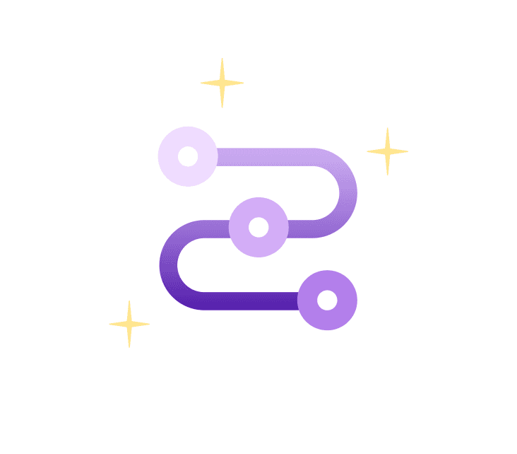
option 4
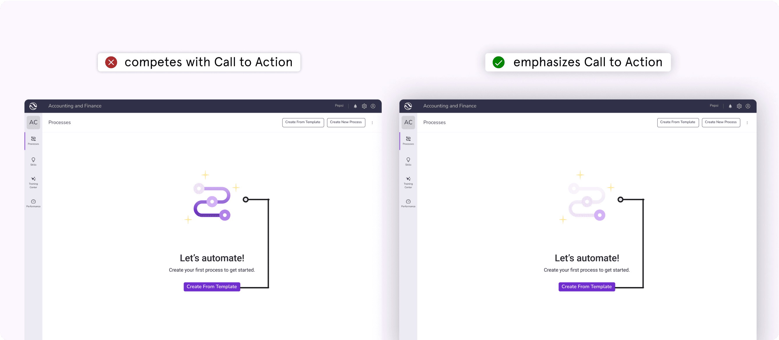
This illustration simply visualizes what an automation process is, while bringing delight.
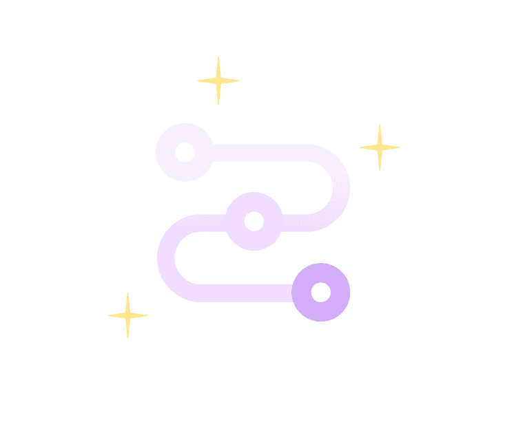
option 5
We landed on the lighter version, as it did not compete with the Call to Action.
Creating joyful dashboard insights
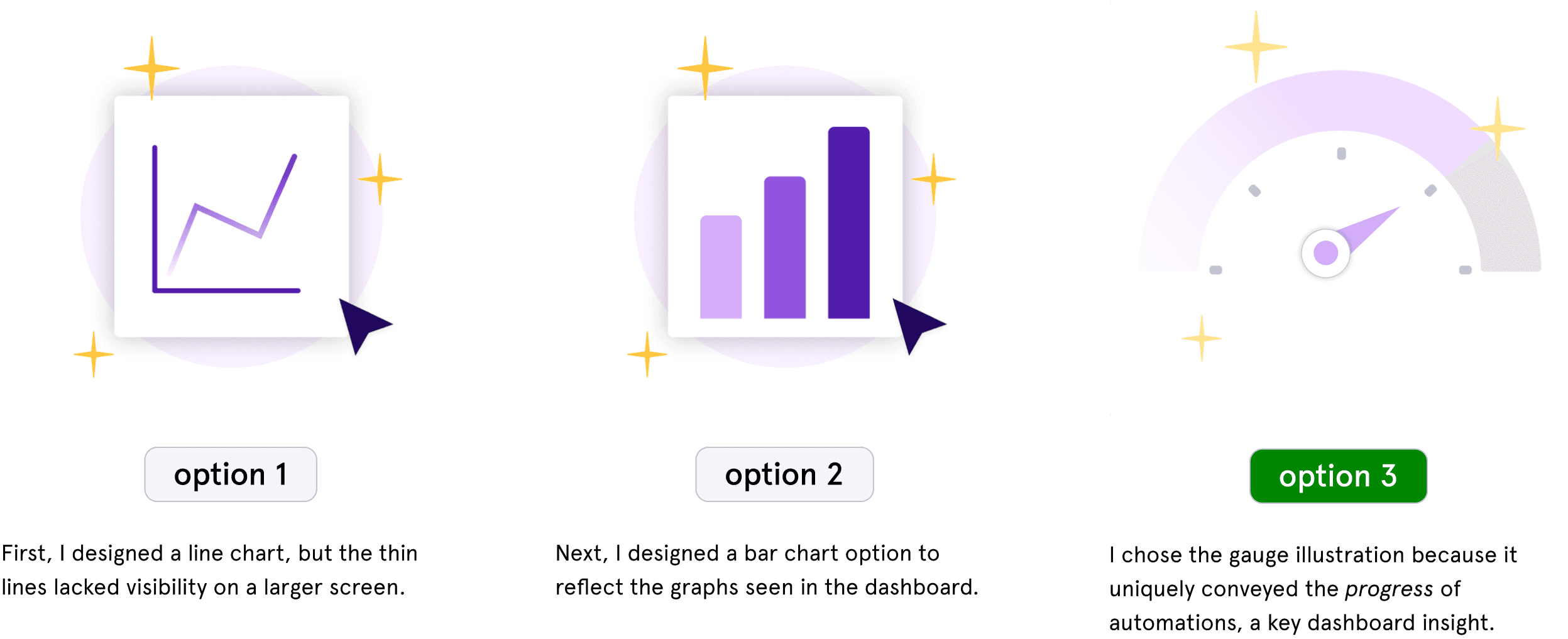
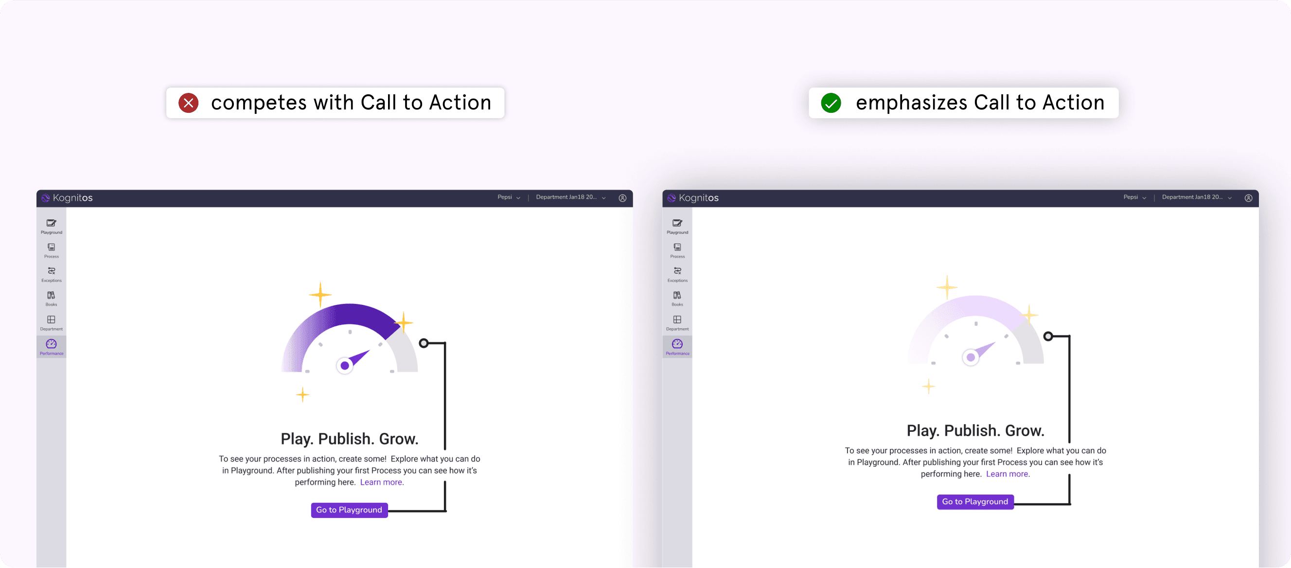
Next, I created an empty-state for the dashboard page, when users don’t have any insights yet. I aimed to illustrate a visual that communicated process insights and progress, while giving users joy when they saw an empty page.
Similarly, I had originally made the gauge illustration a darker purple, but after design reviews with the product design team, we landed on the lighter version (right) so that users don’t get lost on the page and focus on the Call to Action.
Crafting Premium upgrade prompts to foster customer loyalty
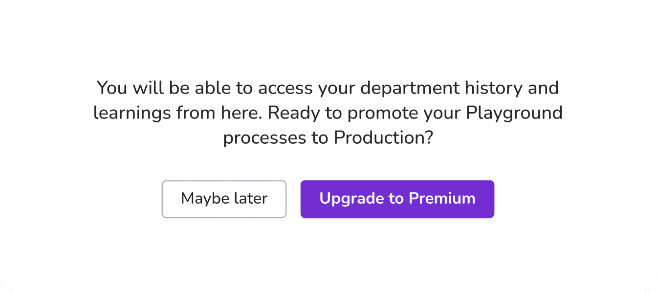
The next state I worked on was promoting Premium features to users who weren’t yet Premium members with Kognitos. Balancing a mix of both empathizing with the user and business goals, I carefully crafted messages that gently reminded users about Premium value, without appearing pushy.
option 1
I explored a footer design to differentiate this screen from the other empty-state screens. However, the Call to Action is purely voluntary, and as a result, users aren’t inclined to upgrade to Premium. Additionally, the copy doesn’t emphasize the value of upgrading.
option 2
In this exploration, the modal has a clear Call to Action guiding users to upgrade to Premium. It also provides a secondary option of “Maybe later,” subtly reminding users that upgrading is still an option in the future.
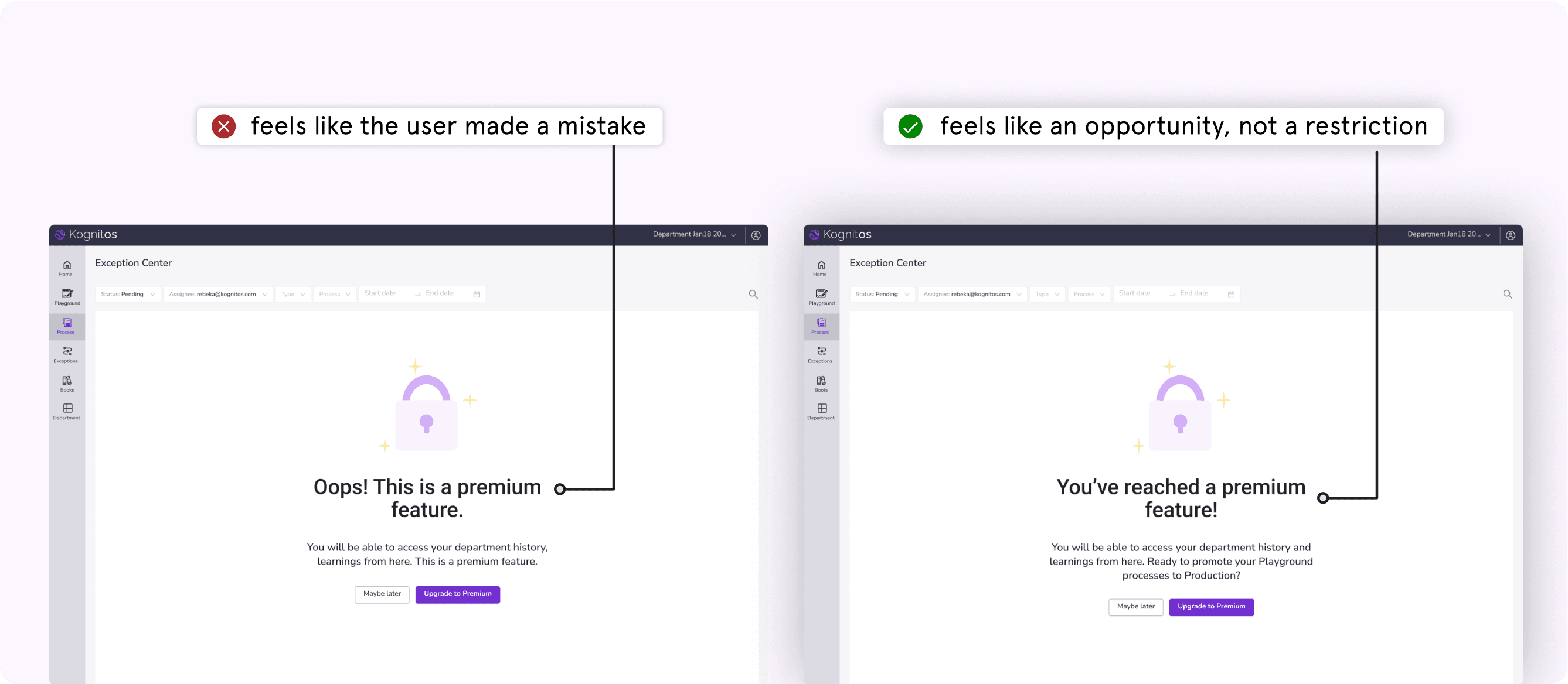
After choosing Option 2, I designed a lock illustration and content for the upgrade prompts. I was careful to use a transparent and simple tone of voice, building trust with the user. In my iterations, I chose the prompt that made users feel like upgrading was a valuable opportunity.
project 2: ux Data visualizations
Why are data visualizations important?
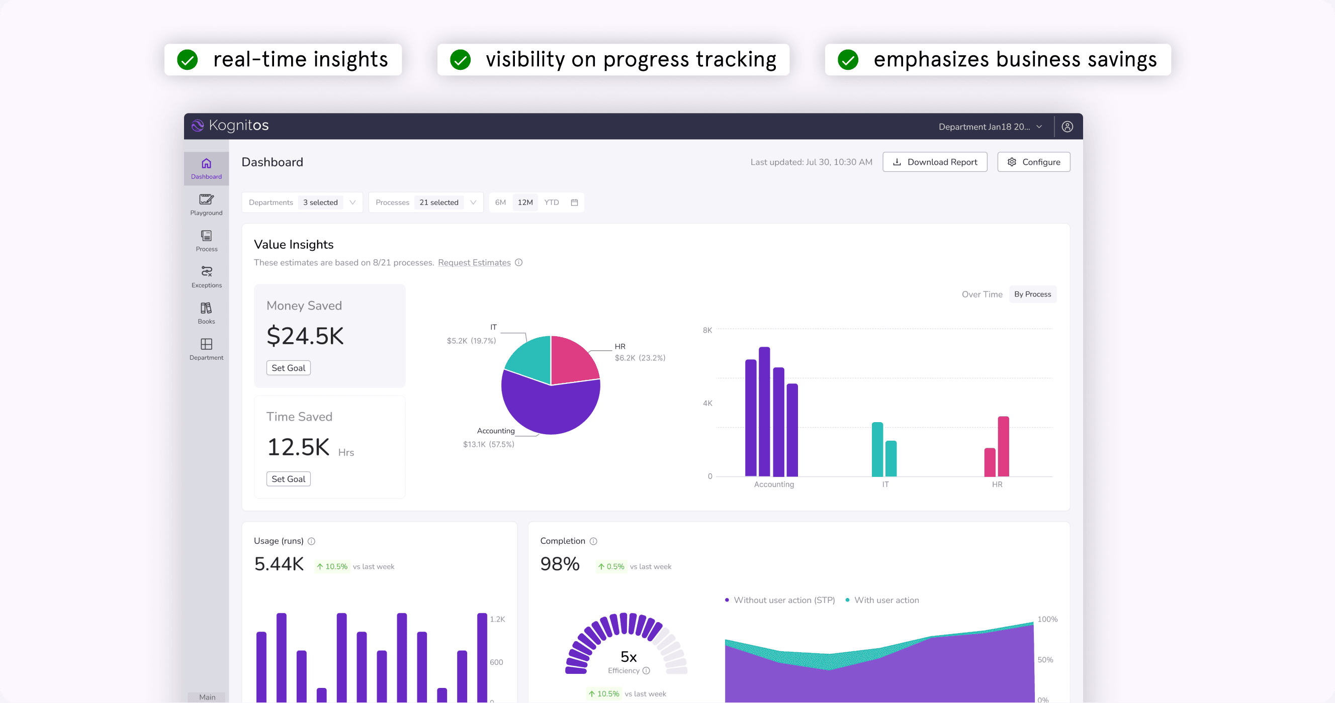
The enterprise dashboard in the Kognitos platform allows users (our customers) to view insights and track progress regarding their process automations. Data visualizations are important to users by simplifying complex data, identifying patterns and trends, and boosting accessibility.
UX Research Findings:
Insights from existing research with business execs (C-suite), the key users of the platform, revealed pain points:
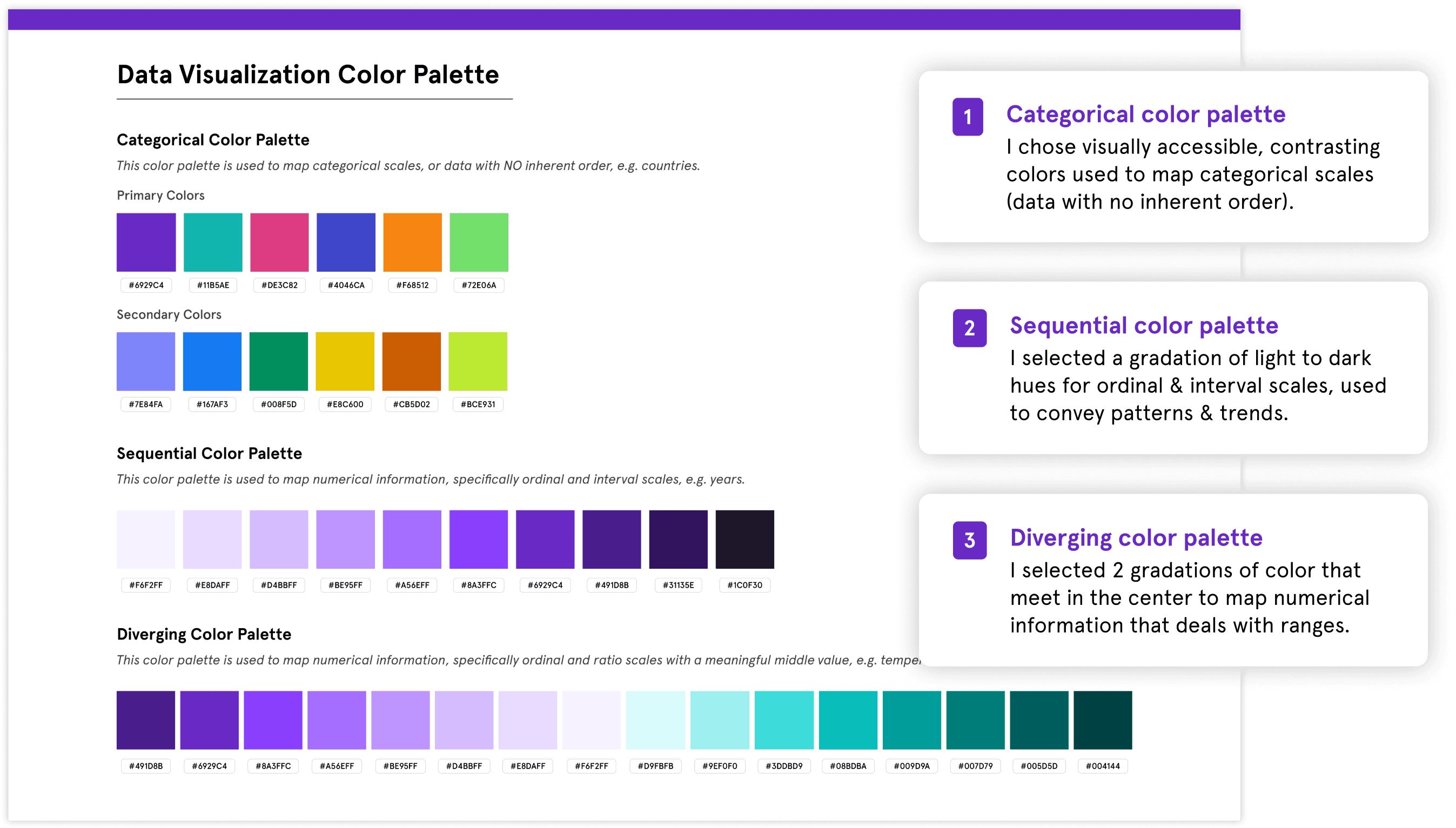
ux accessibility standard color palettes
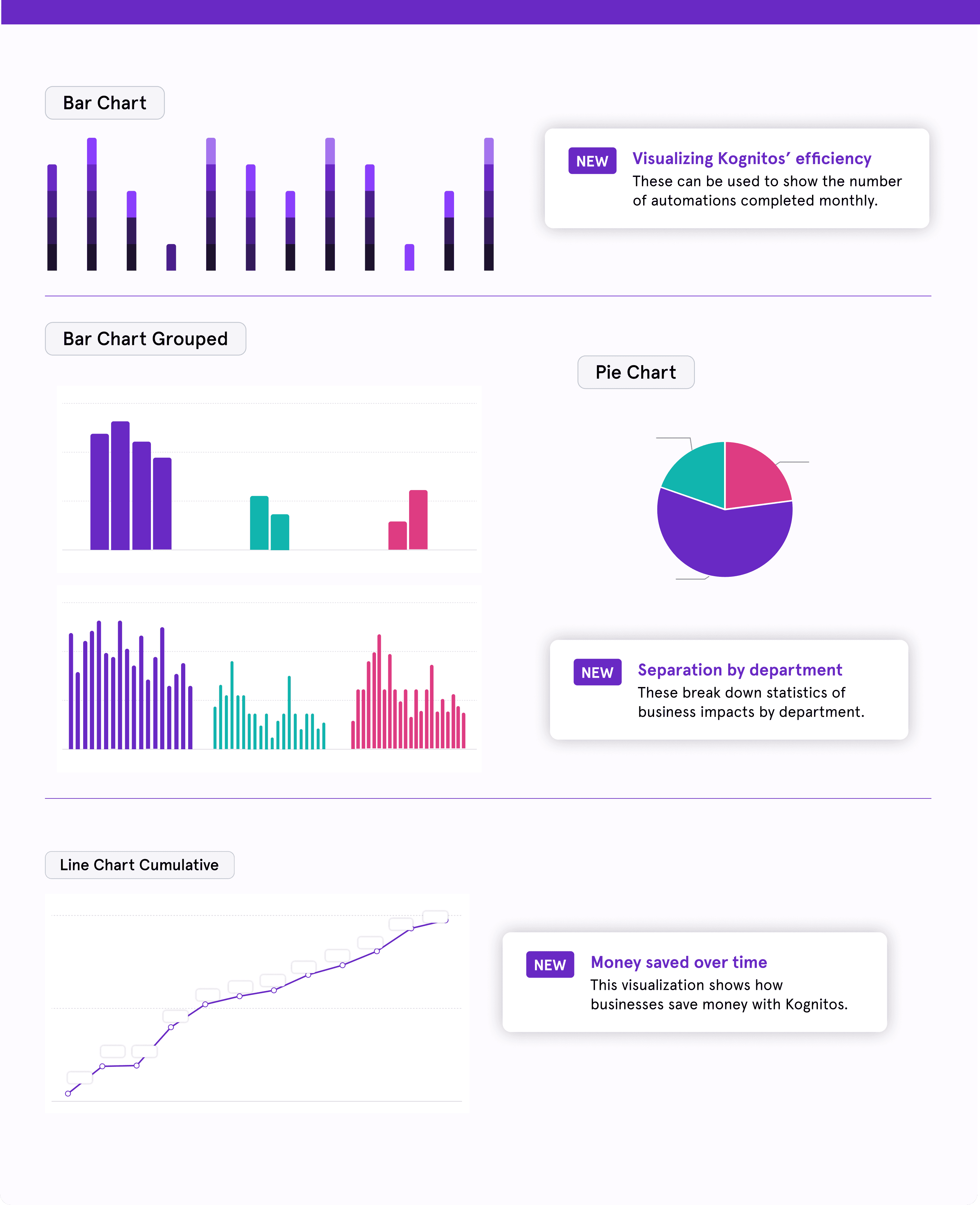
I was tasked with creating a design system for the data visualizations on the dashboard. This was a newer concept to me, so naturally I first conducted extensive research into best design practices for UX data visualizations. From choosing color palettes to types of graphs for different categories of data, I documented my research to support my design choices. I ran color blindness tests on each color palette to ensure they were accessible for diverse users.
Researching best design practices for data visualizations
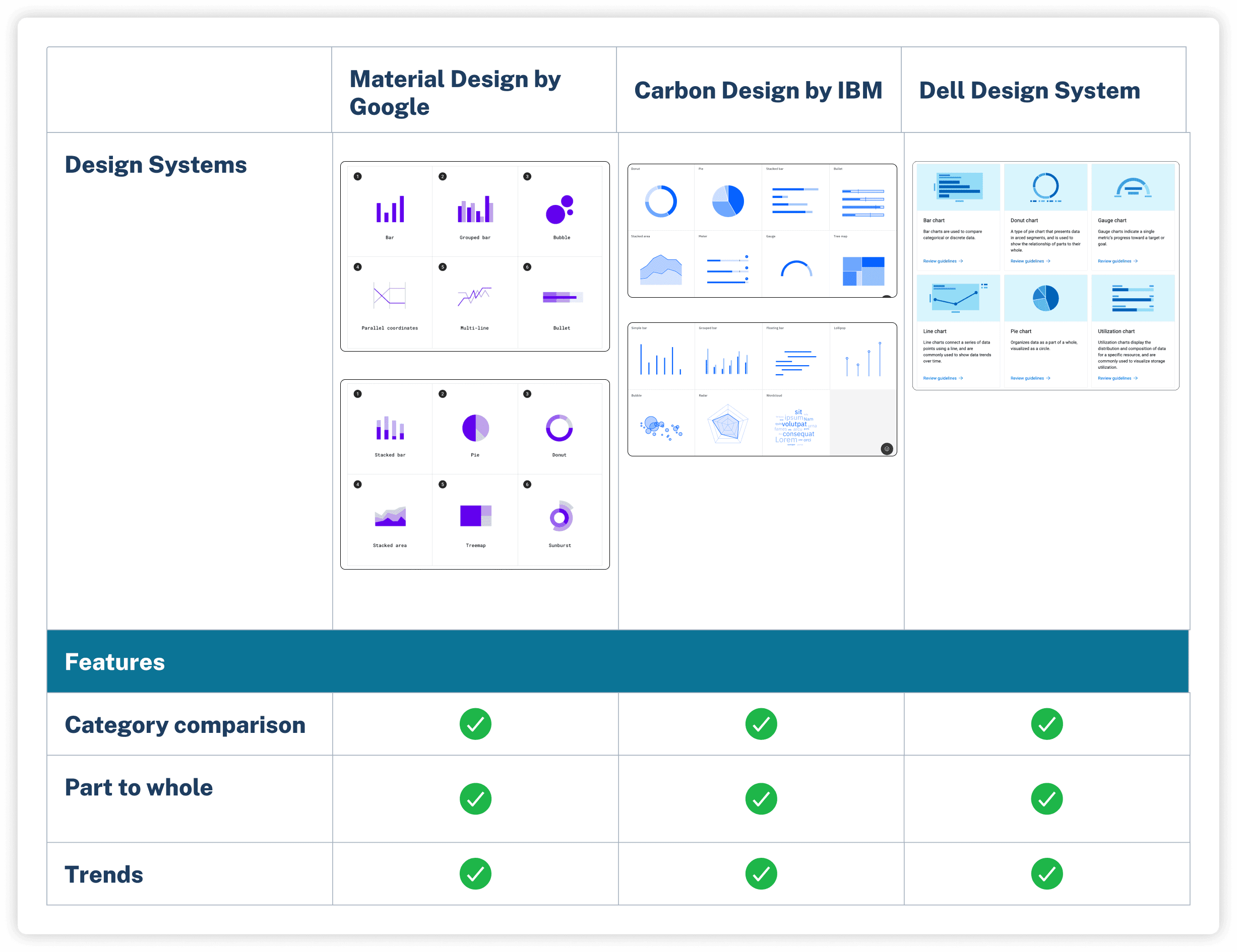
By analyzing major design systems, I learned that data visualizations should include category comparison, part to whole, and trends. Research concluded that graphs should categorical, sequential, and diverging color palettes each served different types of information.
usage guidelines
Systems thinking: creating use cases in the design system
To support the design team in using cohesive graphs in the dashboard, I designed different types of data visualizations as reusable components. From bar graphs to line graphs to progress arcs, each type of visualization is aligned intentionally with a specific color palette based on the type of information we’re conveying. Product designers can re-use these components throughout their work, maintaining accuracy and cohesiveness.
outcome: a key selling point for kognitos
The final dashboard using my components has become a key selling point for the Kognitos platform. The data visualizations emphasize Kognitos’ value to businesses in a digestible manner, allowing C-suite executives to visualize the progress of their automation processes in real-time. Overall, the feature has received high praise from customers and boosted customer satisfaction.
reflections
Feedback is a gift
Over the course of my internship, I had to juggle multiple projects at once. In order to make sure that I was producing high-quality work in each area, I consistently sought out feedback from product designers - both during 1:1’s and design reviews. Although it can be scary to show my work to others, I learned the value of receiving feedback and incorporating it into my designs to align with business goals. I found that my most valuable moments with teammates came out of being able to articulate my design rationale, while being open to honest feedback.
Growth and comfort can’t coexist
I found myself saying “Yes” to new opportunities from the design team. While I had never designed data visualizations or empty-state illustrations before, these projects pushed me to go outside my comfort zone. In the process, not only did I did add new skills to my toolset, but grew into a versatile designer. I cherish the amount of trust the product design team had in me and am grateful for all the learning opportunities from this experience. In the future, I hope to continue being challenged in my work.
thanks for reading!

