Overview
MY ROLE
Product Designer
TIMELINE
10 weeks / Nov 2023 - January 2024
TEAM
3 Designers / 9 Developers / 1 PM
TOOLS
Figma
Firebase
React Native
solution preview
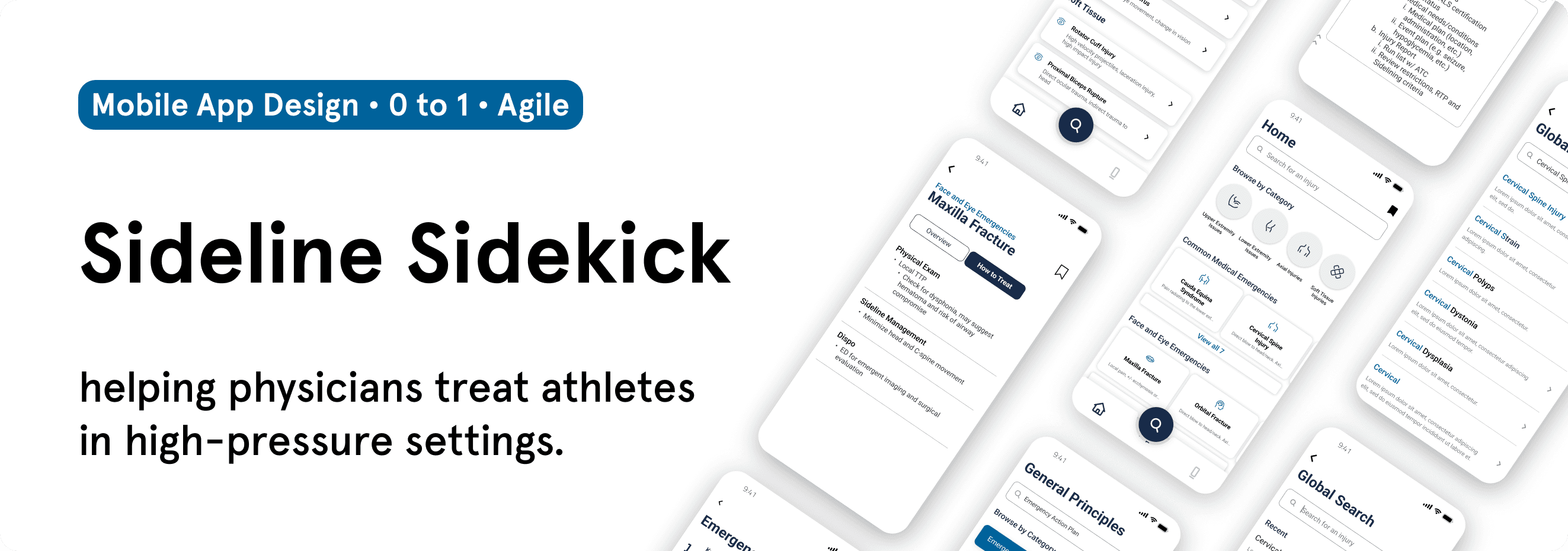
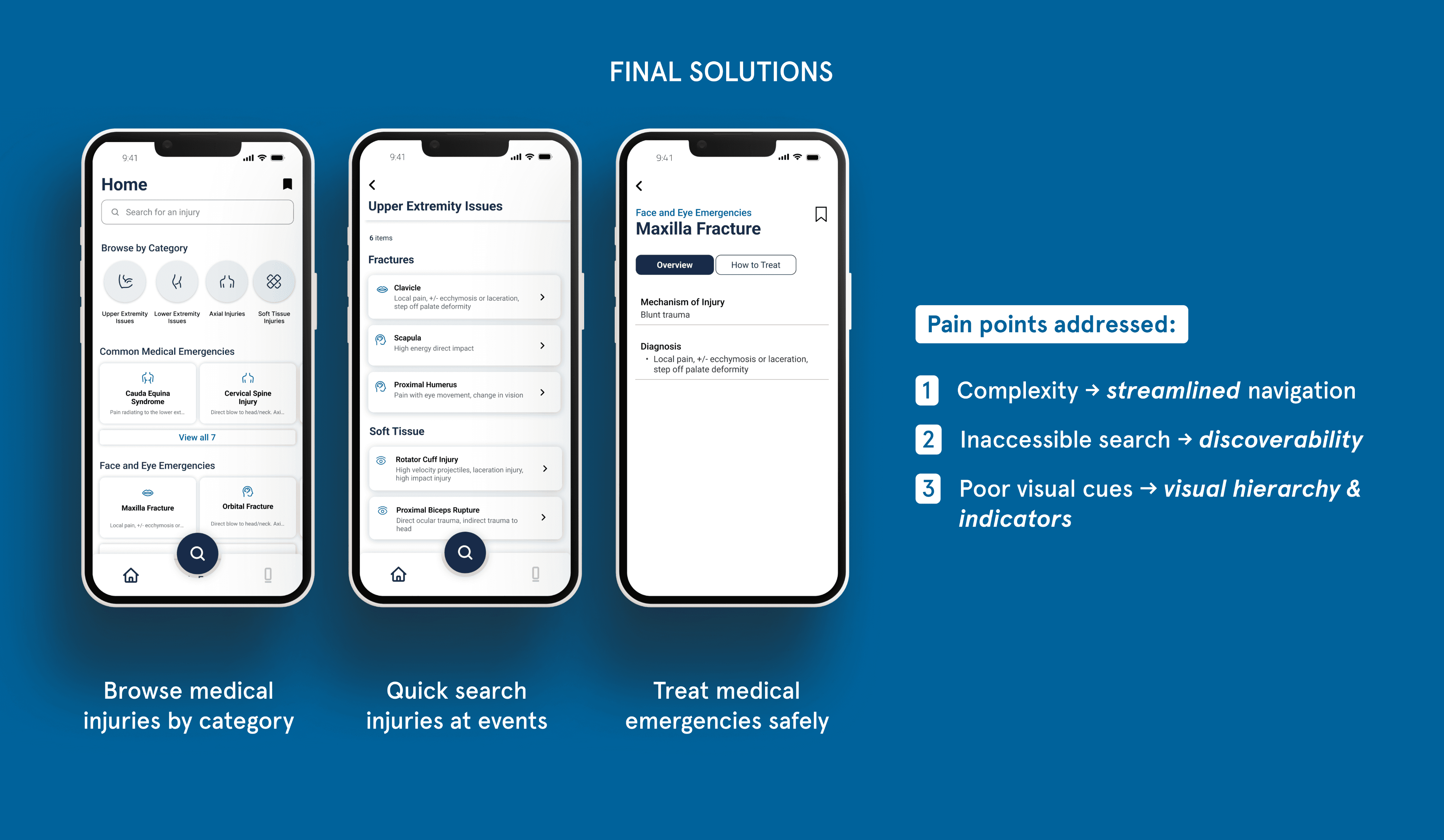
Quickly access a medical emergency at events
Used in high pressure settings, physicians can spend less time searching for injury protocol and more time treating athletes.

Look up injury treatment protocol anytime, anywhere
Quick search and identify injuries with key words. Designed for sports medicine physicians to access medical library of 150+ injuries.
success metrics
47% ↓
Reduced search time
to find injury treatment protocol, compared to previous method
100%
Success rate
among 13 users during task completion in 2 usability testing sessions
“The designs are really clean and intuitive!”
says William Andrew, Head Physician @ DFMDSM
💬
context
Our client, UCSD Division of Sports Medicine, treats professional sports teams
I did this project as a part of Triton Software Engineering, a UCSD student organization that builds pro-bono software for local organizations. My client was UC San Diego’s Department of Family Medicine Division of Sports Medicine (DFMDSM), a leading program composed of 8 faculty physicians serving professional athletes; some notable teams they serve are US Women's Soccer, US Figure Skating, and San Diego Padres.
Working with 2 other designers and 8 developers, this project emphasized cross-functional collaboration in an agile setting. In this case study, I'll specifically share my design work and thought processes, and explain how the designers and I worked together to achieve our final solutions.
the problem
Inefficient treatment procedures
This is the current 170+ page sports injury manual physicians use to reference treatments at on-call events.
Insights from a user research survey and interviews with physicians revealed the following pain points:
!
Complex navigation
The PDF is unorganized and lengthy, causing excessive scrolling to locate the desired injury protocol.
!
Lack of search functionality
Finding specific injuries / relevant info is difficult without a structured search process.
!
Poor visual cues / organization
Lack of logical hierarchy in organizing injuries plus low visual cues makes it difficult to digest crucial details.
our solution & deliverables: sideline sidekick
Through an offline-accessible design, how might we make treating injuries in high pressure settings easier and quicker?
In a real medical situation, it’s important for a physician to be able to find the correct medical protocol fast to treat emergencies in real-time. With no existing product on the market to tackle this challenge, we came up with Sideline Sidekick, a mobile application that helps physicians quickly find the correct protocol in an emergency field medical situation.
Why a mobile application was the right solution:
secondary research
Why a competitive analysis?
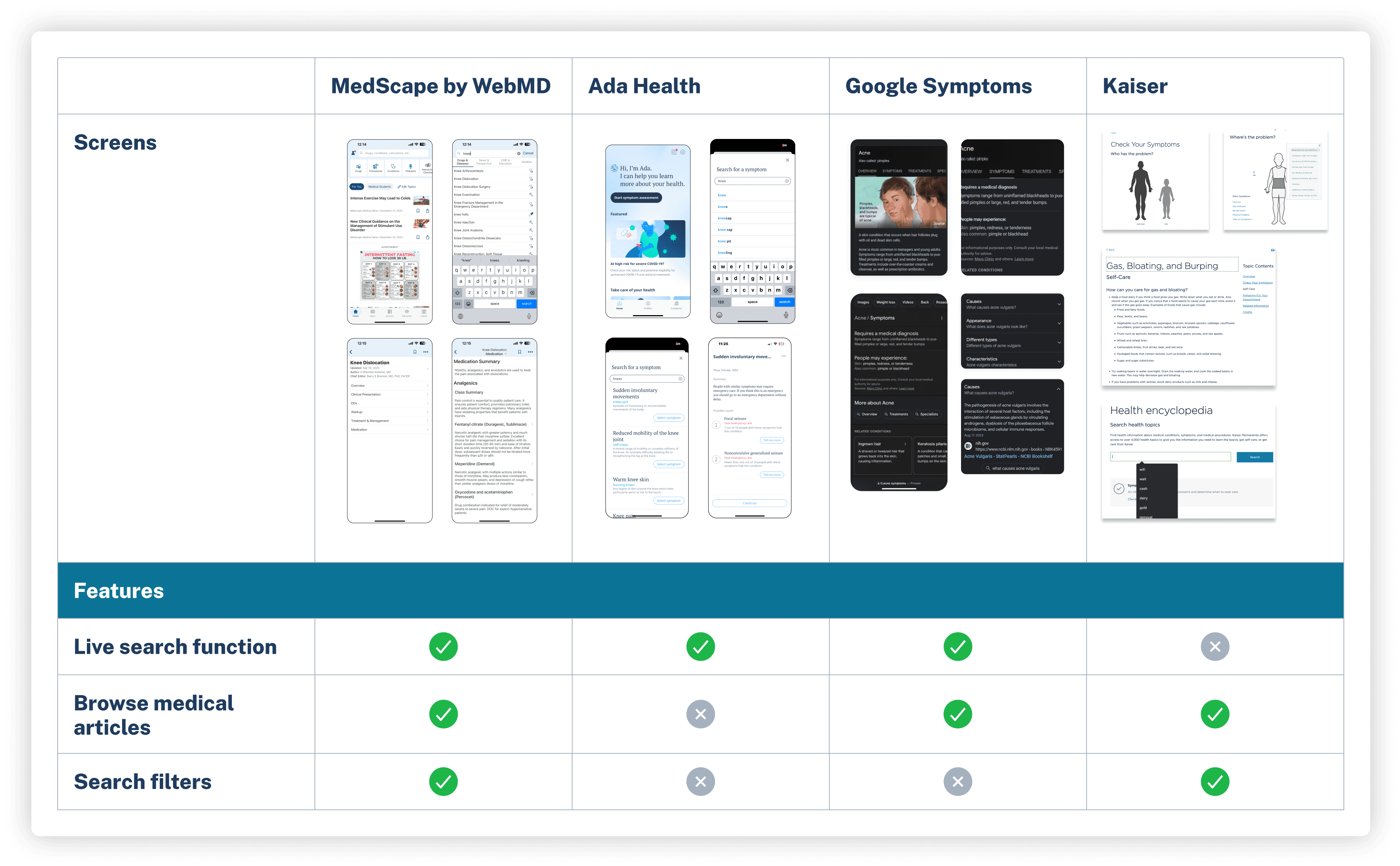
There aren’t any applications on the market catered toward sports medicine physicians referencing injuries in high-pressure settings, requiring an out-of-box approach. So, I sought out existing medical products, such as Google Symptoms and Kaiser, to understand best design practices in sorting medical information. This analysis was key in helping me make informed decisions going into the ideation process.
Scoping out the project
What features are needed for a Minimum Viable Product?
Since the project was on a restricted timeline, my team and I split up the design stage into phases. From there, we brainstormed the most important and necessary features, pitching an MVP to the client to get the project started.
product strategy
Visualizing user goals
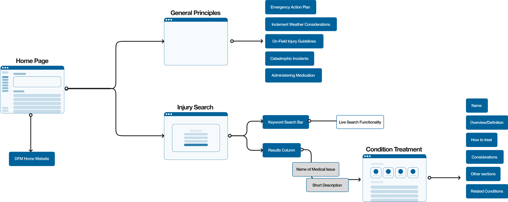
Our goal is to facilitate an intuitive flow to access the search function and reduce treatment time in high-pressure settings. Based on the how might we statement, the designers and I constructed a user flow to better visualize how a physician achieves their goal: after finding the medical condition that physicians are searching for, they should quickly find an overview of the injury and how to treat it.
1
2
3
ideation: home page
Exploring early solutions
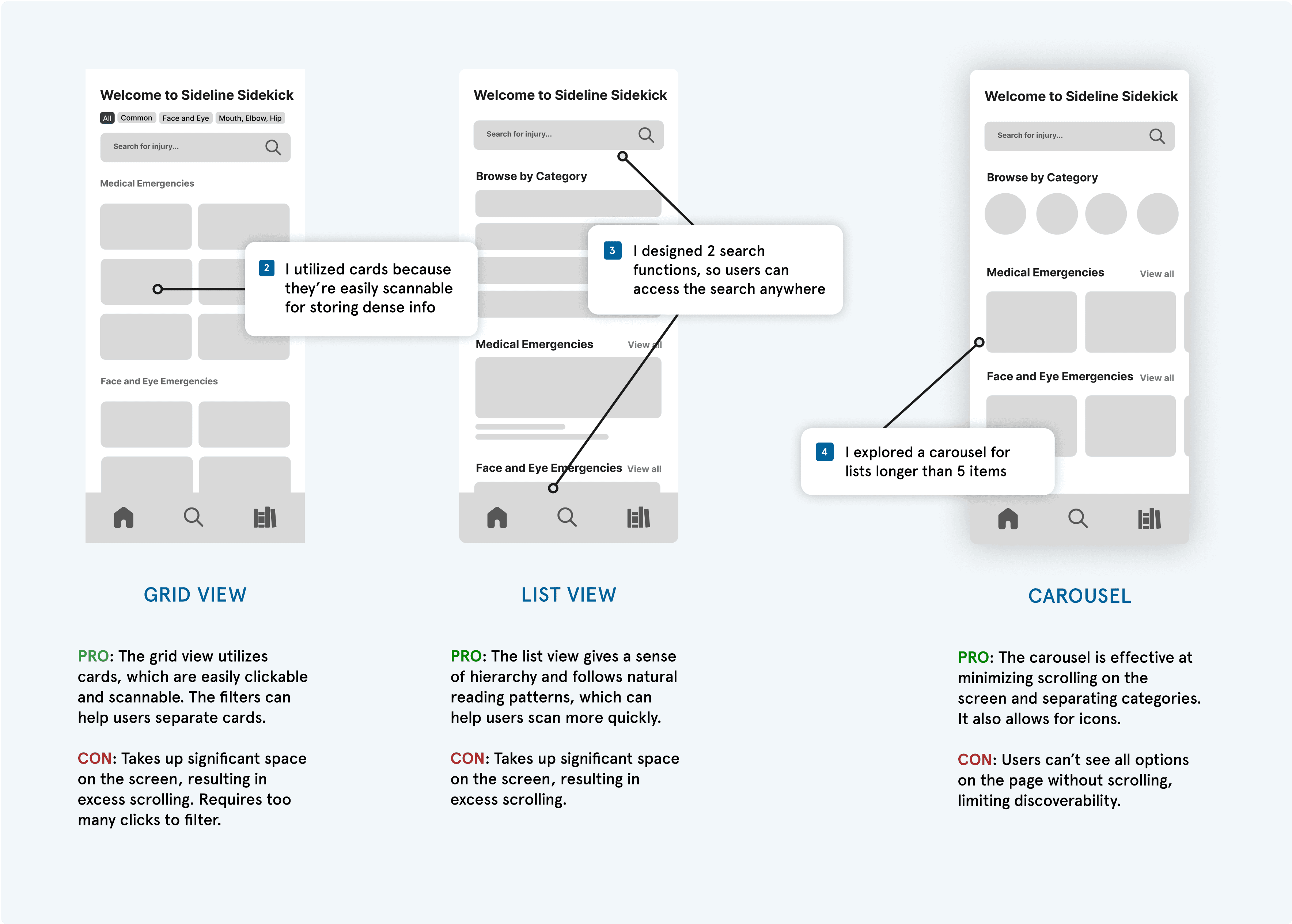
I had to design a home page that would fit 150+ medical injuries, emphasizing the importance of exploring mobile app design patterns to best structure content. When structuring information architecture in low-fidelity explorations, I explored 3 common hierarchies: grid view, list view, and carousel. I evaluated each version using metrics to establish clear navigation, prevent cluttering, and minimize scrolling. I also included physicians’ input at this stage to determine information architecture that best minimizes their learning curve when using a new product.
visual design
Designing scalable solutions to support real use cases
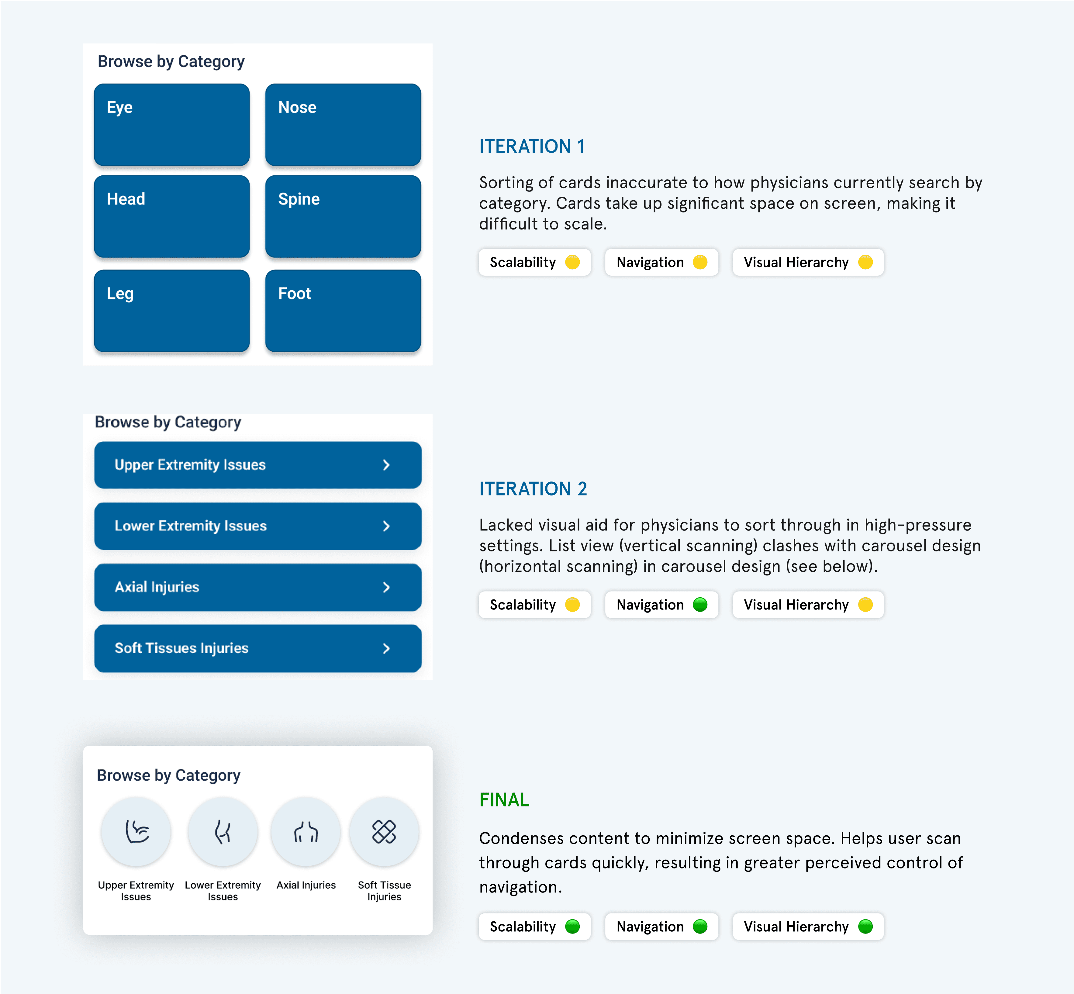
I realized that my initial idea of sorting injuries by anatomy had to be adjusted to meet stakeholder needs. Given this challenge, I focused on the visual hierarchy of the ‘Browse by Category’ cards to create a structured search process, utilizing usability testing insights to deliver the final designs.
interaction design
Prioritizing accessibility and visual hierarchy
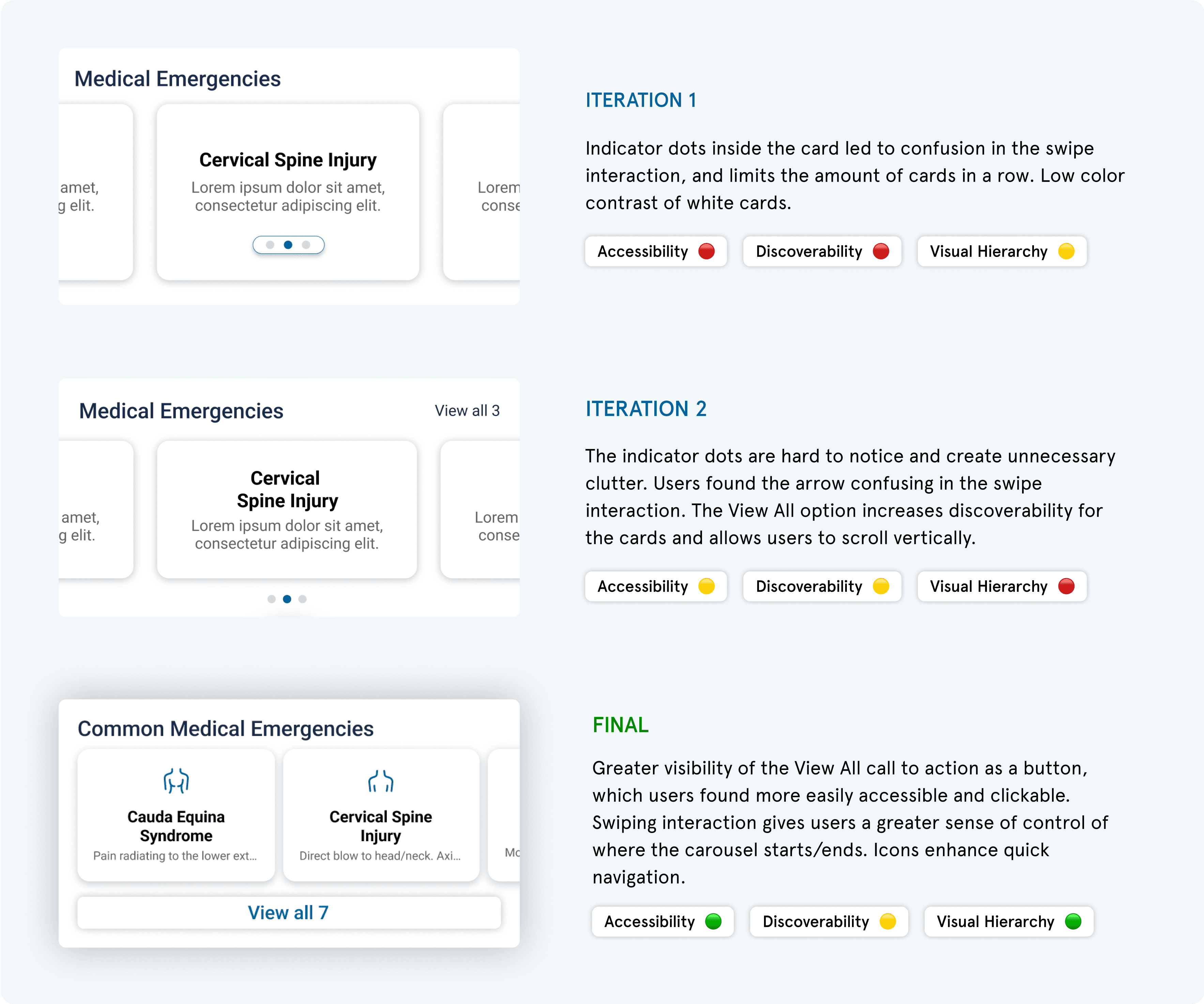
The client requested requested I incorporate 20 medical emergencies onto the home page for direct access to injury protocol. Although I couldn’t reduce the amount of text (a constraint), I chose to sort the medical emergencies into carousels of highly-related injuries, preventing excessive scrolling while utilizing visual indicators to separate categories. My carousel design went through several iterations, as I gathered actionable feedback from 2 rounds of usability testing to design the most effective interaction.
USER TESTING & iterations
Putting it all together
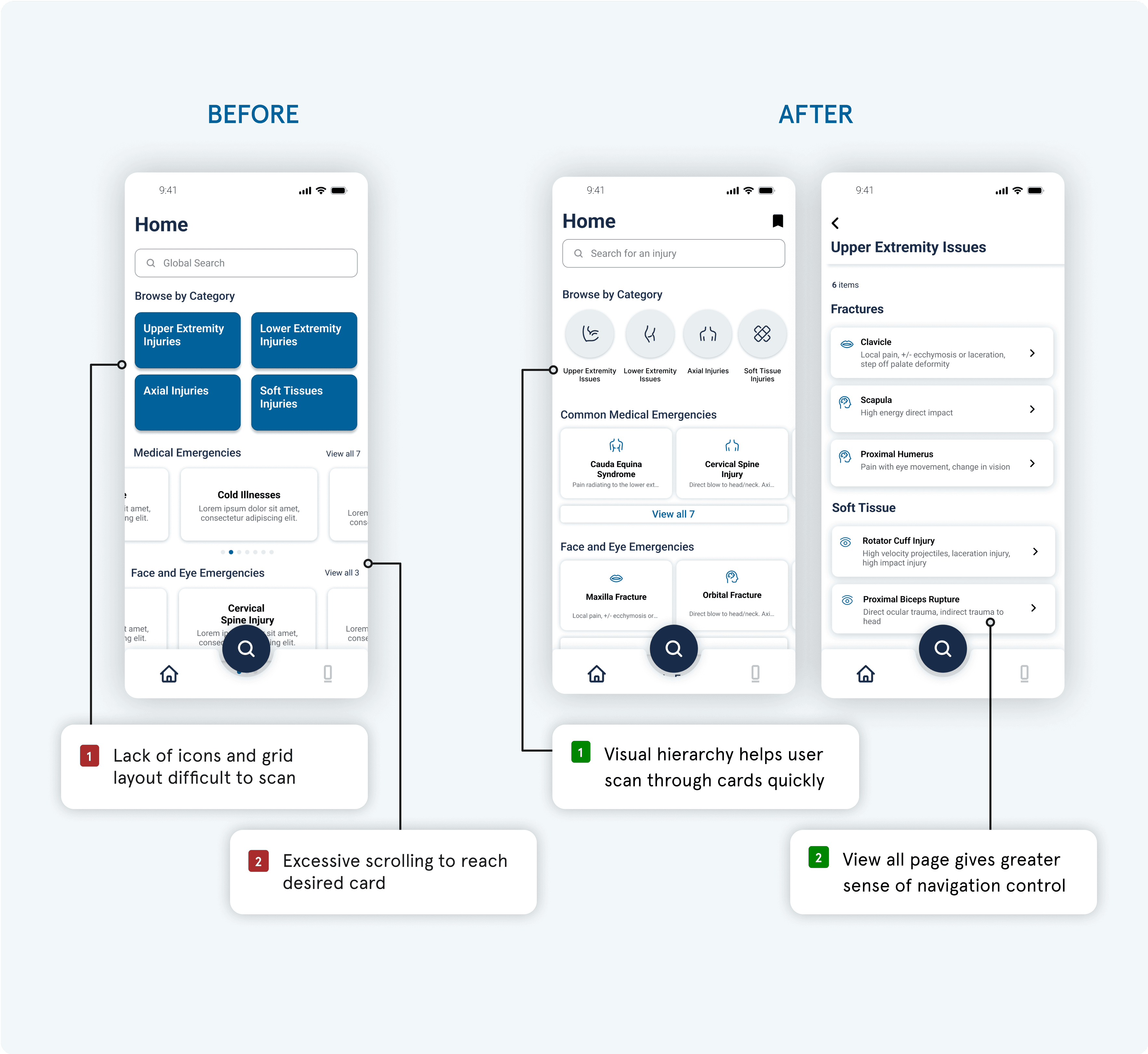
Given feedback from 2 separate usability testing sessions, I iterated my designs into the new search flow. The final version utilizes visual hierarchy principles, icons, and call to actions (View All) to help physicians best navigate through dense information when searching for injury protocol in high-pressure settings.
design system
How I design for interfaces at scale
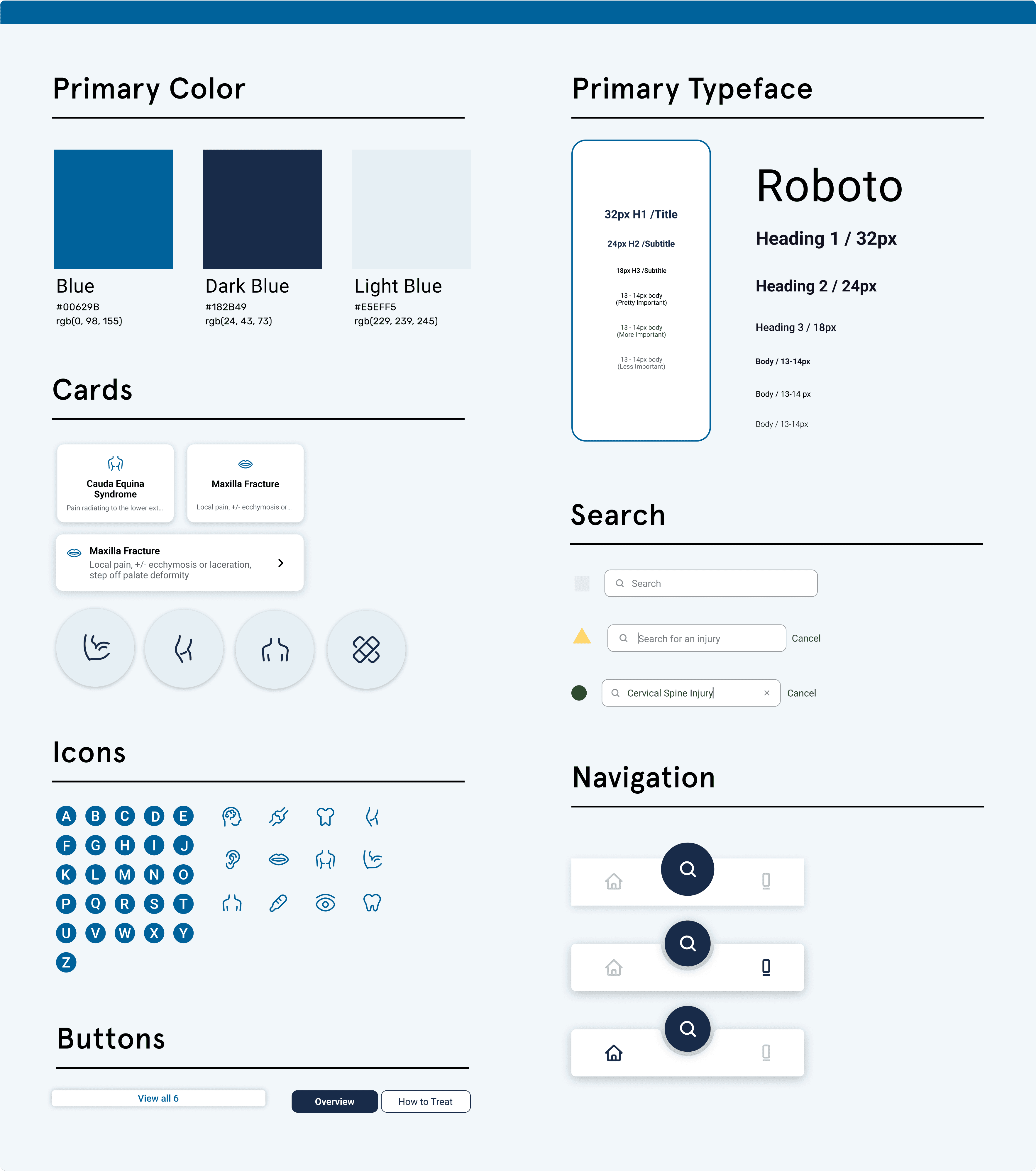
We aligned with UC San Diego’s branding to meet our client’s needs, incorporating their color palette and typeface. Since there were 3 designers on the team, we collaborated to build a design system, allowing us to reuse standardized components and maintain interface consistency. I specifically designed cards for users to visualize medical conditions, exploring edge cases with varying icons and truncated text. Additionally, I integrated my carousel designs from this project into TSE's internal design system, utilized by designers and developers across the 100+ member organization.
outcome / next steps
Gather metrics and feedback from physicians
Our product has been handed off to the client, and was developed for both iOS and Android users. I plan to gather more success metrics, conduct usability testing among physicians, and explore edge cases. If I had more time, I would implement features such as voice-to-text search, body diagram visualizations, and an onboarding quiz.
what i would’ve done differently
Don’t be afraid to go back to the drawing board
It can be easy to get attached to design solutions, especially when they’ve been fleshed out. However, when given major feedback, it’s important to take a step back and visit new ideas in the ideation phase, exploring different solutions to find the best one.
reflections
Lead with curiosity
While I was initially nervous about doing a medical project, something I had limited knowledge of, I really immersed myself into my work with all the nitty-gritty details. Being open to learning about how physicians worked — through personal research and interviews — helped me design from a place of empathy & strategy, with the end goal of improving patient care among physicians and athletes.
At each step of the development process, it was critical for me to clearly explain my design choices to outside perspectives. Given pushback, I learned to be adaptable to incorporating feedback while also advocating for my designs in team settings. I refined my communication skills and learned how to clearly and confidently present my work.
thanks for reading!

